Antique Tuscans in America
by David Shields. Average Reading Time: about 20 minutes.
In the spring of 2017, Bill Moran at the Hamilton Wood Type & Printing Museum Museum invited me to write an article on a topic of my choosing (always an enticing offer) for their website’s blog to be of general interest to their members (always a daunting task). I decided to focus on a particular design that acted as a through-line to several of my typographic interests, and one that led back to the Museum. The Rob Roy Kelly American Wood Type Collection, for which I had acted as Design Curator from 2004–2012, holds a very early font of type cut by Hamilton (or one of his first employees) sometime during the first twelve months of starting his company in 1880. The face is an expanded variant of Antique Tuscan a general term applied to a wide range of styles. This particular design was a member of the sub-set of styles often referred to as American Tuscan. I am reposting this article, originally published 23 August 2107, with minor stylistic updates.
Preamble: A curious Hamilton connection … or the case of the disappearing type design
One of the first fonts of wood type cut commercially by J E Hamilton, and known still to exist, is curiously not at the Hamilton Wood Type & Printing Museum. A 6-line cut of Hamilton’s No 14 (Antique Tuscan Expanded) is today part of the Rob Roy Kelly American Wood Type Collection at The University of Texas at Austin{1}. Kelly acquired the font — a full set of capitals, numerals and various punctuation — in the early 1960s from a print shop in Fremont, Nebraska. Kelly showed this face on page 279 of American Wood Type:1828–1900 and on page 51 of his 1964 Folio. Though the type does not have a manufacturer’s stamp — and there is no evidence currently available to indicate Hamilton ever stamped Holly Wood Type — it does have an original paper label affixed to the « W » that indicates that the font of type was manufactured sometime between August 1880 (when Hamilton began commercial production) and December 1881 (when he partnered with Max Katz of Milwaukee to incorporate Hamilton & Katz).
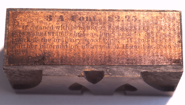
The title on the paper label (as well as the price for the font scheme) indicates the type was produced before Hamilton’s partnership with Katz. Paper labels were often used in place of a manufacturer’s stamp. Because they were affixed only with glue, it is rare to find original labels in place.
Typically, after introducing a type design, the manufacturer tended to make the design continuously available — listed, though not always shown — in each of their published specimen catalogs. Hamilton’s No 14 is an interesting aberration from this practice. Hamilton & Katz’s second surviving specimen catalog, Catalog No 6 from 1884, showed No 14 (Antique Tuscan Expanded) and No 15 (Antique Tuscan Extended). This is the only known catalog to show or list No 14 and to show that particular design of No 15. Hamilton’s No 14 was roughly the proportions of Antique Tuscan Expanded and showed an « E » with a seriffed crossbar. The 1884 version of No 15 roughly matched the proportions of Antique Tuscan Extended (slightly wider than the Expanded), the « E » shown had no serif on the crossbar. After 1884, No 14 disappeared and was never listed or shown by Hamilton again. No 15 was redrawn to match the proportions of the Antique Tuscan Expanded, and though it gained a seriffed crossbar, was distinctly different visually from the previous No 14, particularly in the stroke contrast.
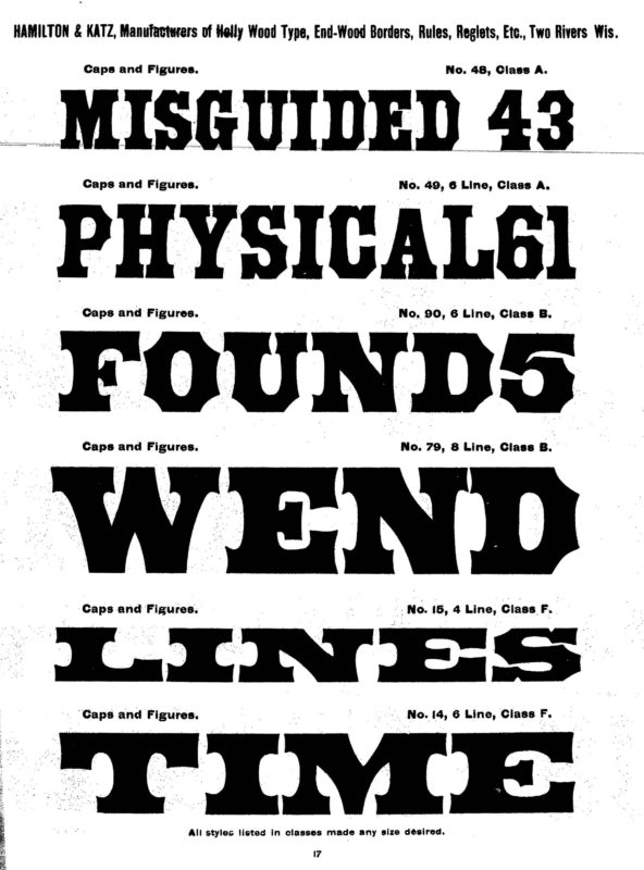
From page 17 of the 1884 Specimen of Holly Wood Type, manufactured by Hamilton & Katz, Two Rivers, Wis. held on microfilm at the John M Wing Foundation, Newberry Library, Chicago, Illinois. This specimen is also available as a facsimile, reprinted by Pioneer Press in 2011, with a new introduction by David W Peat. It is worth noting, as evidenced by this specimen page, that up until at least late 1884, Hamilton used unique numbers for distinct sizes of particular designs. No 90 is the 6-line cut of Antique Tuscan, while No 79 was the 8-line version. By the specimen catalogs of the later 1880s, this practice had been abandoned for the more typical practice of wood type manufacturers using one set of master designs to cut all sizes of the typeface.
Tuscans and Antique Tuscan, in particular, played an important role in American visual culture in the 19th century. It’s also an important aspect of typographic history, as evidenced by the style’s consistent presence in printed ephemera from the period. Hamilton would show a range of Antique Tuscans into the first decade of the 20th century.
An introduction to the Tuscan
Tuscan is a general term, “presumably invented by the type-founders”{2} used to name an eclectic style that grew to include a staggering variety of designs. Tuscans can be described as decorative display faces with characteristics that usually include one or more of the following: bi- or trifurcated (branched) serifs or mannered stroke terminations (pointed, rounded, concaved, chiseled, wedged…); an active, energetic contour; and medial decoration. Tuscans can also be additively ornamented (shades, shadows, fills, patterned interiors…).
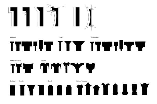
Rob Roy Kelly demonstrated in his American Wood Type: 1828–1900, that Tuscans were derived from one of three primary, plain-faced styles: Roman, Antique, or Gothic.
When derived from Roman they show a distinct contrast in stroke weight with clearly serifed terminals; derived from Antique they are characterized by bold-faced slab serif forms showing minimal contrast in stroke weight; and, when derived from Gothic the terminals are serif-less, though mannered, and the strokes can vary from low to high contrast. The outer shape of the plain-faced style is manipulated to produce an active contour. The extreme to which the contour of the letterform is manipulated can make it difficult to clearly determine from which primary style it was derived, as reducing from or adding to the original form can often produce similar visual results. This indeterminacy can easily blur traditional classification taxonomies.
Tuscan Origins
Though it had a long history as a manuscript and inscriptional letterform dating back to at least the 4th century, the first typographic Tuscan did not appear until the early nineteenth century.
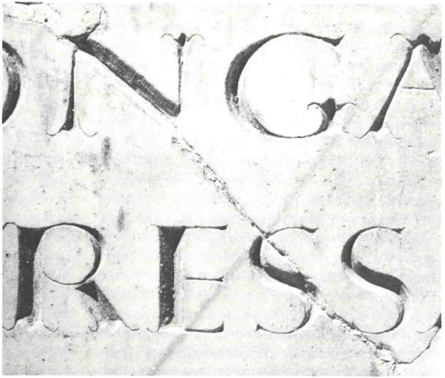
Detail of an inscription designed by Furius Dionysius Filocalus, from the catacomb of San Callisto, Rome. As shown on page 30 of Nicolete Gray’s 1986 A History of Lettering. (Oxford: Phaidon Press Ltd.)
Vincent Figgins, the English type founder, in the 1815/1817 Specimen of Printing Types, by Vincent Figgins, Letter Founder showed a 4-line Tuscan named simply: Ornamented No 2. This was an ornate style derived from Roman as evidenced by its contrasting stroke weights. It exhibited a complex exterior with bifurcated serifs and intricate interior ornamentation.

4-line Ornamented No 2, as shown in the 1967 Vincent Figgins Type Specimens, 1801 and 1815, Reproduced in Facsimile / Edited with an Introduction and Notes by Berthold Wolpe. (London: Printing Historical Society.)
Nicolete Gray indicated that the first typographic Tuscans were modeled on the English Vernacular letterform, with its square proportions, “its spurred G, double curved R, and E with vertical serifs and upper and lower arms of equal length.”{3} This style of Tuscan would quickly be adopted and embellished by most all typefounders in Europe and America.
The first Tuscans produced as wood type originated in the United States by Edwin Allen and were shown in George Nesbitt’s 1838 First Premium Wood Types Cut by Machinery. All of Allen’s designs followed the highly ornate European style first shown by Figgins and were available in sizes from 4- to 28-line.
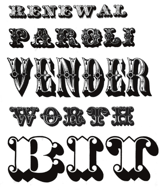
A selection of European style Tuscans from Nesbitt’s 1838 specimen catalog. From top: 4-line Tuscan Ornamented Shade, 6-line Parisian Fancy, 12-line Venetian, 6-line Tuscan Ornamental, 14-line Tuscan Open Shaded.
With its active contour and complex interior ornamentation, the Roman derived European Tuscan is categorized as an ornamental letterform. The ornamental European Tuscan would remain popular in Europe throughout the nineteenth century, but in America, by the 1850s the European Tuscans were being supplanted by domestic variants derived from Antique and Gothic letterforms categorized as a semi-ornamental letterform.
Antique Tuscan
In American Wood Type: 1828–1900, Rob Roy Kelly defined semi-ornamental wood type as, “…solid faced letters, frequently derivative in design, that obtain a decorative quality from an active contour, and that generally include some visual ambiguity between letterform and counter or between adjacent letterforms.”{4}
In the late 1840s, there were a number of Tuscan designs introduced, derived from Antique that were semi-ornamental in nature. These Antique Tuscans would supplant the European Tuscans in the 1850s. All of the serifed semi-ornamental design of this period were named Antique Tuscan typically with a number added to the name to differentiate the variation.
One variant of Antique Tuscan, a fairly reserved semi-ornamental concave slab serifed configuration would gain broad popularity in America. The exterior perpendicular lines of the Antique were manipulated into concave curves that produced scallops and points energizing the contour of the letterforms. The cap- and baseline contour remained parallel.
This fairly simple alteration of the original form provided a rich visual vocabulary that would remain popular in America for the rest of the nineteenth century. These designs — a subgroup of Antique Tuscan — would come to be referred to informally as American Tuscan.
The American Tuscan is important in that it was one of only a handful of type designs during the nineteenth century that originated solely as wood type and in America, rather than being borrowed from foundry designs or based on European originals.
The full face version of the American Tuscan was first shown by Wells & Webb in their 1849 Specimen of Wood Type, “Cut by Machinery”. They named this face Tuscan Antique and showed it in three sizes: 6-line, 8-line, and 10-line. It would prove popular and was quickly duplicated by all American wood type manufacturers, though most used the name Antique Tuscan.
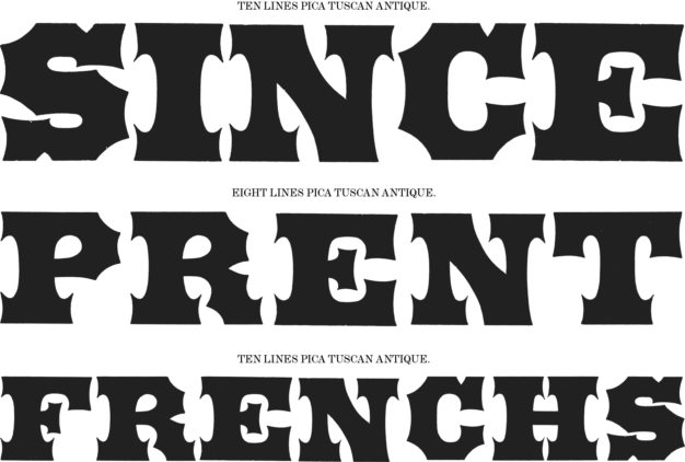
First Antique Tuscans as shown in the 1849 Specimen of Wood Type, “Cut by Machinery” by Wells & Webb, and for Sale at Their Printers’ Warehouse, 18 Dutch Street, Cor. of Fulton, New York. Held in the American Type Founders Library Collection, Butler Rare Books Library, Columbia University, New York, New York.
American type foundries also copied the design. By the late 1850s, the foundries were also showing a range of stylistic variations in metal type that would seemingly become ubiquitous in America by the 1860s. Most foundries appear to have named the design Antique Pointed, though there are also examples of the later Extended and Expanded styles appearing under the name Broadguage.
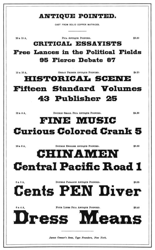
From David W Peat’s 2011 facsimile of selected pages from James Conner’s Sons 1888 Abridged Specimens of Printing Types, Brass Rule, Electrotypes, and Revised Catalogue of Printing Materials.
In Wells & Webb’s next known specimen catalog, the 1854 Specimens of Wood Type, Manufactured by Wells & Webb, a range of widths of the American Tuscan were shown for the first time including Antique Tuscan Extra Condensed, Antique Tuscan Condensed, and Antique Tuscan Extended.
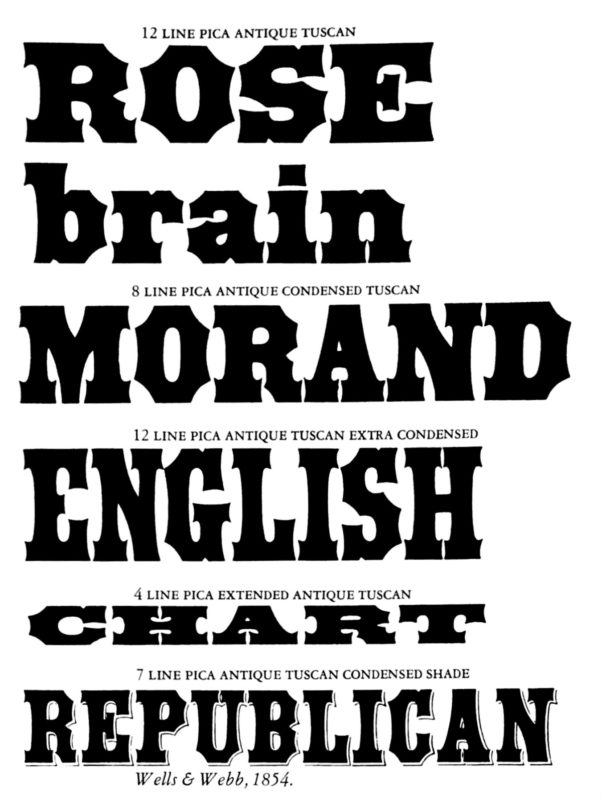
Rob Roy Kelly showed this composite sample from Wells & Webb’s 1854 specimen catalog on page 120 of American Wood Type:1828–1900.
That same year, through their distribution partnership with American type foundries, Wells & Webb would also introduce stylistic variations that included Antique Tuscan Open, Antique Tuscan Open Shade, and Antique Condensed Shade {through W & H Hagar, New York} Antique Tuscan Condensed Shade (renamed Antique Tuscan Condensed Light Shade) {through White & Co, New York}, and Tuscan Antique Shaded, an outline shaded variant {through L Johnson & Co, Philadelphia}.
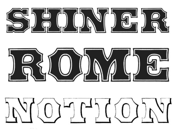
Composite sampled from W & H Hagar Specimens of printing types, ornaments, borders &c from the type and stereotype foundry of W & H Hagar 1854. From top: 6-line Antique Tuscan Open, 8-line Antique Tuscan Open, and 6-line Antique Tuscan Open Shade.
In 1859, both William H Page & Co and J G Cooley & Co — though it is unclear which was first to market — released the first Antique Tuscan Double Extra Condensed, the narrowest and thinnest variant of the style. The two designs were strikingly similar, and both included a concave curve to the cap- and baseline, a subtle departure from previous variants of this growing stylistic group. In 1865, William H Page & Co released Antique Tuscan XX Condensed No 1 that supplied a parallel cap- and baseline to the double extra condensed design.
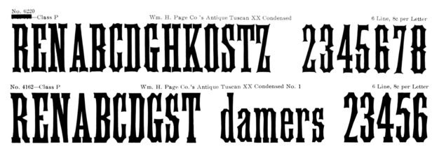
William Page’s Antique Tuscan XX Condensed and Antique Tuscan XX Condensed No 1 as shown on page 172 of The Hamilton Mfg Co’s omnibus 1906 Catalog No 16 held in the collection of the Hamilton Wood Type & Printing Museum.
Antique Tuscan Expanded, a slightly condensed variant of Antique Tuscan Extended was first listed for sale as wood type by William H Page & Co in January 1865, and first shown in the 1867 William H. Page & Co’s Specimens of Wood Type, Manufactured at Greenville, Conn.
Antique Tuscan Shaded
Bill, Stark & Co of Willimantic, Connecticut was the first wood type manufacturer to introduce shaded variants to the growing American Tuscan group. Tuscan Antique Shaded No 1 was an outline face with solid dimensional shade, Tuscan Antique Shaded No 2 was an open face with solid dimensional shade, and Tuscan Antique Shaded No 3 was an open face with outlined dimensional shade. Each were shown at 8-line in the company’s 1853 Specimens of Machinery Cut Wood Type. Though Bill, Stark & Co never showed or indicated that these designs could be paired chromatically, William H Page & Co showed their own version of these three cuts chromatically paired in their 1874 Chromatic Wood Type, Border, &c.
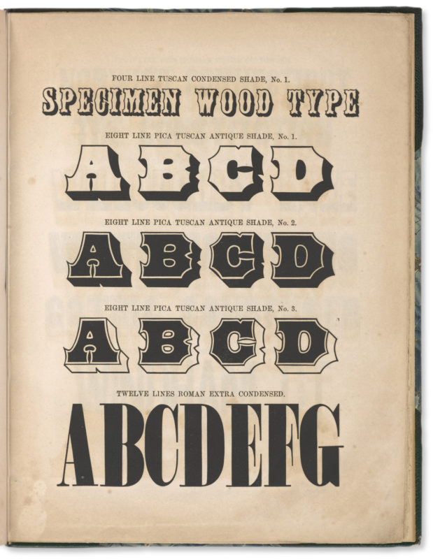
The seventh page of the 1853 Specimens of Machinery Cut Wood Type, Manufactured by Bill, Stark & Company, Willimantic, Connecticut. Held in the American Type Founders Library Collection, Butler Rare Books Library, Columbia University, New York, New York.
A number of American Tuscans were also cut as streamers — letters cut in reverse on a solid block, capped at either end with ornamental pieces. A variety of designs were released including Antique Tuscan XX Condensed Streamer, Antique Tuscan XX Condensed Streamer No 1, Antique Tuscan Condensed Streamer, Antique Tuscan Streamer, Antique Tuscan Streamer, Antique Tuscan Condensed Double Line Streamer, and Antique Tuscan Condensed Reversed Streamer. Wm H Page & Co was the first to release almost all of these designs in the late 1870s and early 1880s.
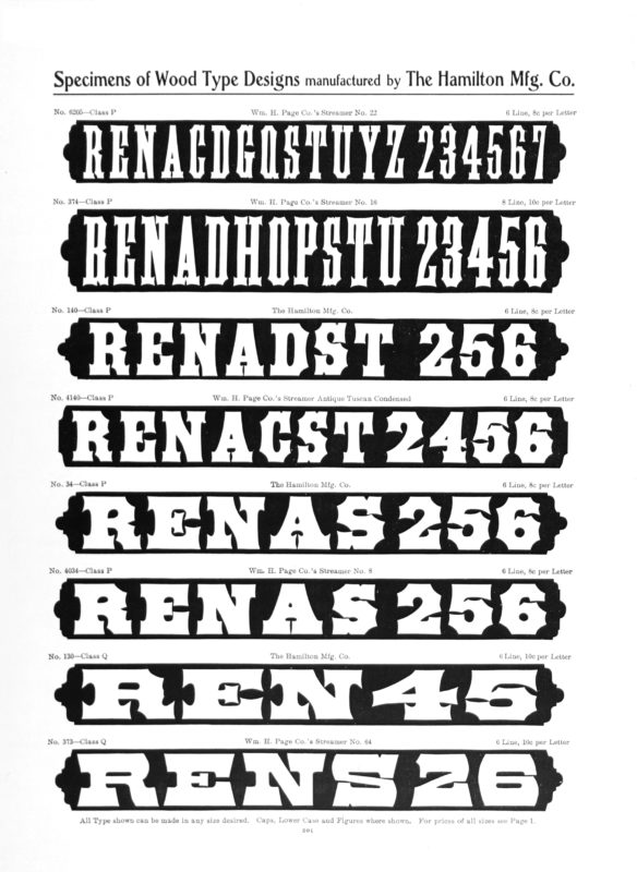
A range of American Tuscan styles cut as Streamers as shown on page 201 of The Hamilton Mfg Co’s omnibus 1906 Catalog No 16 held in the collection of the Hamilton Wood Type & Printing Museum.
The American Tuscan was a robust visual form that could be varied with condensed or extended variations. While it was a semi-ornamental style, like most any plain face design it could also be additively ornamented.
Antique Tuscan, decorated
William H Page & Co showed its own version of Tuscan Antique Shaded No 2 with an open face and solid dimensional shade in their 1859 specimen catalog. In that same catalog, they also showed two decorated variants of this design they named Antique Tuscan Checked and Antique Tuscan Shade No 4. The solid fill portion of the open face was inscribed with a square checked pattern and ticking pattern, respectively. The faces were only ever shown in the 1859 specimen catalog but were included on the price list in every catalog through the 1882 Specimens of Wood Type and Borders.
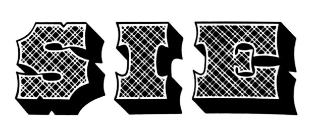
15-line Antique Tuscan Checked, as shown in the 1859 Specimens of Wood Type, Borders, Rules, &c. Manufactured by Wm. H. Page & Co. Greenville, Conn. Held in the American Type Founders Library Collection, Butler Rare Books Library, Columbia University, New York, New York.
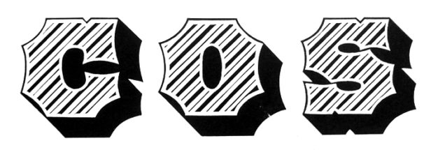
12-line Antique Tuscan Shade No 4, as shown in the 1859 Specimens of Wood Type, Borders, Rules, &c. Manufactured by Wm. H. Page & Co. Greenville, Conn. Held in the American Type Founders Library Collection, Butler Rare Books Library, Columbia University, New York, New York.
Antique Tuscan No 2 & Extended Antique Tuscan No 2
In 1858, David Knox & Co showed an embellished variation of Wells & Webbs’ Antique Tuscan and a similarly embellished variation of the Antique Tuscan Extended. Rather than flat parallel contours of the cap- and baseline found on Antique Tuscan and Antique Tuscan Extended, the cap- and baseline of Antique Tuscan No 2 and Extended Antique Tuscan No 2 was trifurcated producing and exotically contoured letter. Curiously, Knox was the only wood type manufacturer to ever show this particular design.
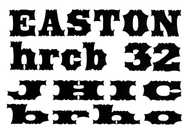
8-line Antique Tuscan No 2 and 6-line Extended Antique Tuscan No 2, as shown on the 1858 Specimens of Wood Type Manufactured by D. Knox & Co., Fredericksburg, Ohio. Held at the John M Wing Foundation, Newberry Library, Chicago, Illinois.
Antique Tuscan Extra Condensed No 7
Another modification to the American Tuscan form was Heber Wells’ Antique Tuscan Extra Condensed No 7. The concave slab serif of the American Tuscan was further modified with notches added to the capline and baseline to produce bifurcations with a symmetrical spur (typically referred to as medial spurs) was added to the middle of the letterforms.
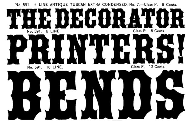
4-, 6-, and 8-line Antique Tuscan Extra Condensed No 7, on page 106 of Richard L Hopkins 2015 facsimile of Heber Wells 1895 Specimens of Wood Type.
American and American Chromatic
American was an ornamented and shaded variation of the Antique Tuscan. Stars were reversed out of the solid fill in the top portion of the letter, and positive stars filled the open bottom half of the letter.
While first listed on Wm H Page & Co’s 1865 price sheet, American was first shown by Page in April 1867 as a two-color chromatic. Vanderburgh, Wells & Co, Morgans & Wilcox, and Tubbs’ American Wood Type each showed a version of this design, though never chromatically. Page showed a non-chromatic variation of American that replaced the stars in the upper half of the letterform with shamrocks. It was named No 102 and was only ever shown in Page’s 1878 Flour Meal specimen catalog.{5}
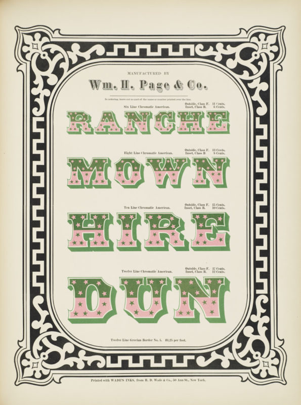
Wm. H. Page & Co. Specimens of chromatic wood type, borders, etc. manufactured by Wm. H. Page & Co. Greeneville, Conn. : The Co., 1874. Electronic reproduction. New York, N.Y. : Columbia University Libraries, 2013. NNC. Columbia University Libraries Electronic Books. 2006.
Expanded No 1, Expanded No 2, and Expanded No 3
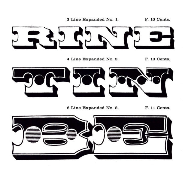
Expanded No 1, Expanded No 2, and Expanded No 3 were three embellished variations of Antique Tuscan Expanded. The three faces were released by Wm H Page & Co and first shown as two-color chromatic wood type in the company’s April 1867 specimen catalog.
Expanded No 1 was the outlined and shaded variant of Antique Tuscan Expanded. Expanded No 2 followed Expanded No 1’s outline and dimensional shade but also included a solid fill in the top portion of the letter as well as a large medial dot, inscribed with evenly spaced horizontal lines. Expanded No 3 followed all of the characteristics of Expanded No 2 but the medial dot was solid. The three styles could be purchased as single color designs or as chromatic pairs — No 1 & No 2 paired, or No 2 & No 3 paired, or any of the three designs paired with the solid faced Antique Tuscan Expanded.
During this period, typically, after a stylistic variation was introduced all other wood type manufacturers quickly followed with their own versions. Through the proliferation of the American Tuscan was seemingly ubiquitous, it was primarily an American phenomenon and did not appear to have been broadly adopted by the European manufacturers. Nicolete Gray does not discuss this design in her overview of nineteenth-century ornamental faces{6}. American Tuscans which originated as wood type and then quickly adopted by the type founders, were a mainstay of American visual culture during the mid-nineteenth century.
By the end of the nineteenth century, the visual exuberance of the Victorian age had begun to wane. Cultural tastes shifted and moved away from the ornamental (and semi-ornamental) styles, to be replaced by more sober typographic forms. This shift in taste occurred as The Hamilton Mfg Co ostensibly consolidated the wood type industry in America. Hamilton last showed American Tuscans in its 1908 Catalog No 17, Hamilton’s Specimens of Wood Type.
Revivals—Phototype
After a sixty year hiatus, the American Tuscan made the transition from wood and metal type in the nineteenth century to photo-type in the mid-twentieth century. Photo-lettering, Inc of New York revived the design in the 1960 specimen catalog Alphabet Thesaurus, including a number of variations. The all-cap configuration was named Grandmother, and the configuration with capitals and lower case was named Cobblestone.
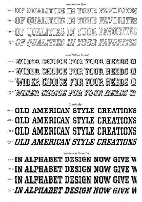
As shown in Photo-lettering, Inc’s 1965 Alphabet Thesaurus, Volume 2 (New York: Reinhold Book Division.)
The American Tuscan was a natural fit for the kinds of asymmetrical distortions possible with photo-type equipment — stretching from condensed to extended, additive decorative embellishments, as well as slanted to any angle desired. The original design variations from the nineteenth century were produced through asymmetric scaling of the full face design with the router-pantograph production equipment. This asymmetric scaling established an elasticity to the external contour that took well to the similar, if more extreme, asymmetrical scaling and slanting possible with photo-type technology. American Tuscans were available as photo-type until the technology was deprecated by the advent of the digital typography and person computer in the 1980s.
Revivals—Digital fonts
There are a number of digital revivals of the American Tuscan that have been released over the last twenty years. Jordan Davies’ Wooden Type Fonts, Antique Tuscan (c2004) and Antique Tuscan Condensed (c2004) and Intellecta Design’s Antique Tuscan Condensed family (2007). All three are currently available at MyFonts.
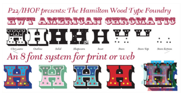
P22’s collaboration with the Hamilton Wood Type & Printing Museum has made two stylistic variations of the American Tuscan available digitally as well. Antique Tuscan Expanded (2006) by Colin Kahn, and American Chromatic (2012) by Richard Kegler and Terry Wundenbachs. Paul Shaw in his Revival Type{7} says of Kegler and Wundenbachs’ American Chromatic that it is close to the original model, “though the decorative stars have been regularized and in several letters more evenly distributed”. The robust set of digital options makes it more versatile than Page’s original. HWT American Chromatic consists of eight fonts: American Chromatic, American Outline, American Solid, American Shopworn, American Inset, American Stars, as well as American Star top, and American Star bottom{8}.
Conclusion
The introduction and expansion of the American Tuscan style by the wood type manufacturers in the 1850s and 1860s was a unique contribution to the formal vocabulary of typographic variation. The style was ubiquitous throughout the second half of the nineteenth century in America. The style would enjoy a revival in the mid-twentieth century as photo-type, thanks in part to its sturdy yet elastic form. American Tuscan continues to be generally available today through a number of digital revivals.
__________- The redesigned and rewritten website for the Rob Roy Kelly American Wood Type Collection is available again online, now at http://rrk.finearts.utexas.edu [↩]
- Gray, Nicolete. Nineteenth Century Ornamented Typefaces. Berkeley and Los Angeles: University of California Press, 1976. [↩]
- Gray, Nicolete. p 14. [↩]
- Kelly, Rob Roy. American Wood Type, 1828–1900: Notes on the Evolution of Decorated and Large Types and Comments on Related Trades of the Period. New York: Van Nostrand Reinhold Co., 1969. p 120. [↩]
- The only known copy of this specimen catalog is held in the collection of the Hamilton Wood Type & Printing Museum. [↩]
- Gray, Nicolete. Nineteenth Century Ornamented Typefaces. Berkeley and Los Angeles: University of California Press, 1976. [↩]
- Shaw, Paul. Revival Type: Digital Typefaces Inspired by the Past. Yale University Press, 2017. p 51. [↩]
- All of P22’s HWT Collection revivals are available on their website p22.com/hwt. P22’s Antique Tuscan Expanded was produced before the Hamilton collaboration and can be found at p22.com/family-Tuscan_Expanded [↩]


