Unit Gothic & Uniform Set Gothic: wood type as precursor
by David Shields. Average Reading Time: about 8 minutes.
“Innovations, being prepared over a long period of time, remained dormant for the most part, undiscovered and misunderstood, only to suddenly awaken, providing a characteristic expression for an entire century.”1
— Fredrich Friedl
The development of the typographic sans serif follows a path of revival and renewal from a crude set of capital letters through a series of stylistic and organizing innovations leading to the formal refinement and complex family structures that we take for granted today. Two recently uncovered designs of wood type reveal that the accepted progress of mid-century conceptual innovations began fifty years earlier than previously acknowledged, or commonly accepted.
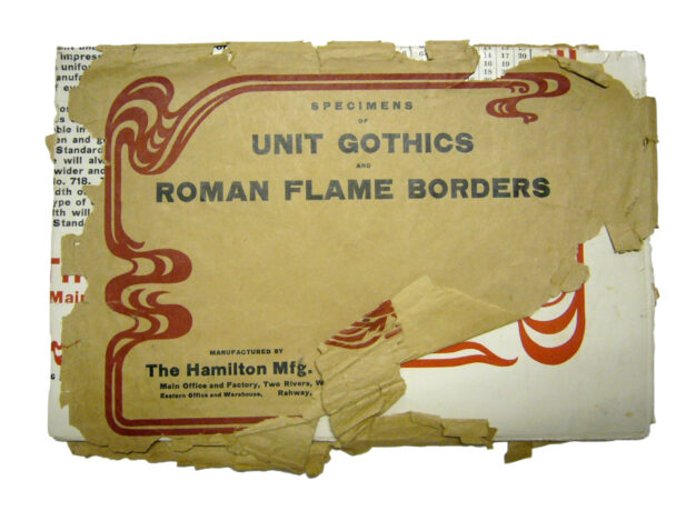
The Hamilton Mfg Co’s Unit Gothic & Roman Flame Borders circular in mailing envelope, published late 1907. This copy is one of five variations of the circular held in the collection at Hamilton Wood Type & Printing Museum, Two Rivers, Wisconsin. Folded size: 9.5 × 6.25 inches.
.
Sans serif faces gained broader popularity in Germany, England, and America at the end of the 19th century. This growing popularity increased the demand for type families expanded beyond the single weight variations that characterized sans serif type up to that point. Berthold’s Akzidenz Grotesk was released in 1896. Cobbled together from existing and new sans serifs “…Berthold managed to make a coherent family out of all the different Grotesks it had acquired.”2 Akzidenz Grotesk’s success was followed by strong competition from Stempel Foundry’s Reform Grotesk in 1903, ATF’s Franklin Gothic in 1905, and the Bauer Foundry’s Venus in 1907. While not fully integrated, the development of more coherent families of related weights and widths pointed to the standardization and modularity that would follow mid-century. The sans serifs released at the turn of the 20th century expanded the traditional palette of typographic variation previously limited to regular, italic and bold by offering three or four weights of a standard width with a weights of condensed and extended added in short order.
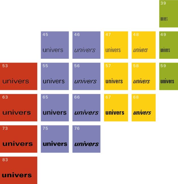
New designs inspired by Akzidenz Grotesk began to emerge in the 1950s, displacing the geometric sans serifs that had become popular in the 1920s and 1930s. These new designs, commonly referred to as neo-grotesque, were typified by larger families of weights and widths developed to provide visual uniformity lacking in the inconsistently designed sans serifs of the early 20th century. The most important neo-grotesques released during this period included the Haas Foundry’s New Haas Grotesk, Bauer’s Folio in 1956, and Deberny & Peignot’s Univers in 1957. Of these, Univers was the most systematically conceived from the start. Designed by Adrian Frutiger, Univers was made up of weights and widths that related modularly to create “a visually programmed family of 21 sans serif” styles which “form[ed] a uniform whole that [could] be used together with complete harmony.”3 It’s systematic ordering along a matrix of two axes revealed a rational and visually harmonious connection between each item in the system.
.
While the styles that made up the families developed at the turn of the century did not relate seamlessly, there were two little known faces produced during this period that would act as precursors to the more systematic type families to be released mid-century and as well as foreshadow the interpolated superfamilies of the late-20th century.
The Hamilton Mfg Co’s Unit Gothics and the Tubbs Mfg Co’s Uniform Set Gothics were released as original wood type designs in the second half of 1907. While neither attained the aesthetic refinement that would define Frutiger’s Univers fifty years later, each was developed as a visually related series driven by a pragmatic need for making composition faster and more efficient.
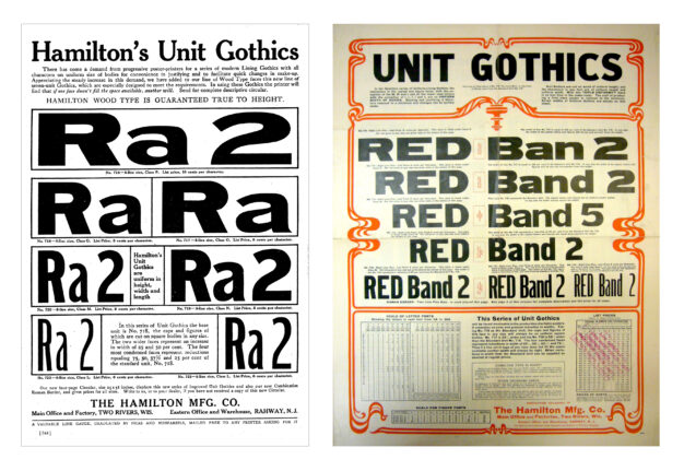
(Left) The Hamilton Mfg Co’s single-page advertisement for Unit Gothics in the August 1907 issue of The Inland Printer. Size: 8.875 × 11.875 inches.
(Right) The Hamilton Mfg Co’s Unit Gothic & Roman Flame Borders circular published late 1907. This copy is one of five variations of the circular held in the collection at Hamilton Wood Type & Printing Museum, Two Rivers, Wisconsin.
Size: 19.125 × 20.125 inches.
.
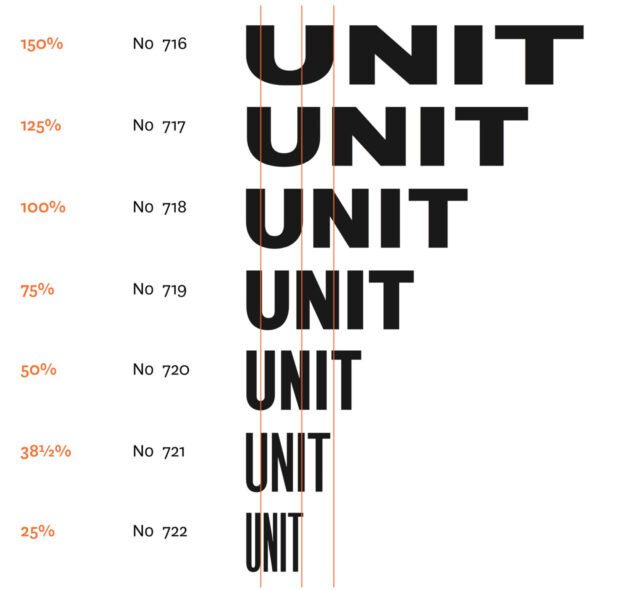
The Hamilton Mfg Co’s Unit Gothics were first shown in the August 1907 issue of The Inland Printer in an advertisement addressed to “progressive poster-printers.” The design concept was unique for it’s time as it included a series of seven systematically interrelated and visually harmonious widths. The Unit Gothics series was numbered, No 716–No 722, rather than named. Each width was scaled mathematically to produce “an even and gradual reduction in widths.”4 No 718 was the standard unit of the series, No 716 and No 717 were extended, and No 719–722 were condensed. No 717 was 25% wider, and No 716 was 50% wider, than the standard. The four narrower faces were reductions in width of 25% (No 719), 50% (No 720), 62½% (No 721), and 75% (No 722). The advertisement also stated that “other variations in the width from the Standard Unit [could] be supplied as desired at regular prices.”
The mathematical scaling was not primarily a function of aesthetics but rather of the pragmatic need for compositional efficiency and speed. All characters were “uniform in width and length” that allowed one letter to be “lifted and another put in its place without further justifying.” The capitals and figures of the standard, No 718, were cut on square bodies. The scaled widths were configured to allow the condensed style to “be placed in the space occupied by one of the standard units, and with the most condensed face four letters will occupy the space of a standard unit.”5
In addition to the ad in The Inland Printer, Hamilton also produced an oversized circular specimen of the Unit Gothics in late 1907. Known copies of this circular are housed in the ATF Library Collection at the Butler Rare Books & Manuscripts Library, Columbia University as well as in the archives of the Hamilton Wood Type & Printing Museum6.
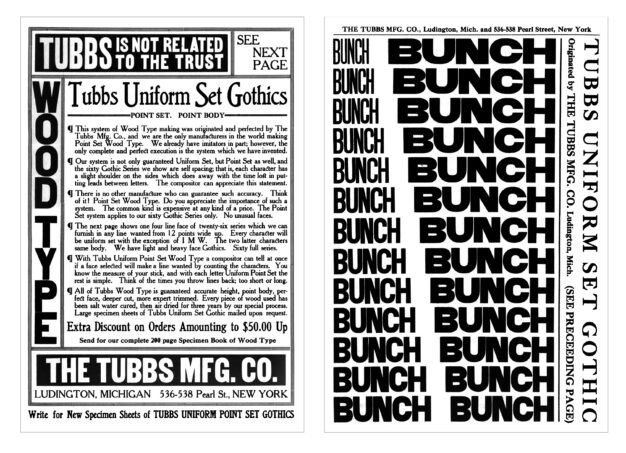
Two page Tubbs Mfg Co’s advertisement for the medium weight of its Uniform Set Gothic from the October 1907 issue of The Inland Printer..
.
The Tubbs Mfg Co’s Uniform Set Gothic was first shown in the October 1907 issue of The Inland Printer. The Tubbs design was much more ambitious than Hamilton’s, if not as mathematically exact. A single stylistic weight included a range of 26 evenly scaled widths. The full series of Uniform Set Gothic was comprised of three weights—light, medium, and heavy—each with a range of scaled widths totaling 60 different faces. The Tubbs ad for Uniform Set Gothic showed the medium weight that included 26 evenly scaled widths. The advertisement promoted the Gothic series as a more efficient system for compositors and stated that all the Gothics were intended to be self-spacing due to “a slight shoulder on the sides which does away with the time lost in putting leads between letters.”7 The ad does not indicate any sort of numbering or naming system to differentiating each weight or width, or even how the scaling between widths was determined. Unfortunately the The Inland Printer ad with these shortcomings of detail is the only known example yet found of the Tubbs’ Uniform Set Gothic. The ad specifically mentions the availability of “large specimen sheets mailed upon request.” Examples of these specimen sheets have yet to be located. The Uniform Set Gothic appears to be the first type explicitly designed along two axes and predates Univers by fifty years.
In October 1908 the Hamilton and Tubbs companies entered into a bitter legal dispute over trade secret infringement. While the case ended with the court dismissing the bill of complaint it led The Hamilton Mfg Co to aggressively buy out Tubbs Mfg Co in June 1909. There is no record of Tubbs’ Uniform Set Gothic ever being shown again. Hamilton never promoted the Uniform Set Gothic, but instead continued to show their own series of Unit Gothics in specimen catalogs well into the 1960s.
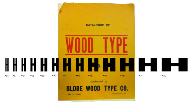
Globe Wood Type Co of Philadelphia, PA showed an integrated set of thirteen gothics in the company’s c1945 specimen catalog Catalogue of Wood Type. There is no exsisting documentation that indicates the company’s systematic approach to this series. This copy of the catalog is held in the collection at Hamilton Wood Type & Printing Museum, Two Rivers, Wisconsin.
.
It is hard to measure the impact of these early innovations on typography as they do not seemed to have directly influenced other work in wood type much less the broader typographic world at the time. The concepts embodied by both faces emerged from their dormancy with greater understanding and popular acceptance fifty years later with the introduction of the neo-grotesques and the systematic approach to constructing type families.
———–
This text, in substantially the same form (though corrected here for typos and reflecting an evolving approach to the serial comma), originally appeared in Slanted No 19, Super Families. Shields, David. “Unit Gothic & Uniform Set Gothic: wood type as precursor.” Slanted, no. 19. 114–115.
- Friedl, Fredrich. The Univers by Adrian Frutiger. Translated by Katja Steiner and Bruce Almberg. Frankfurt am Main: Verlag form GmbH, 1998. [↩]
- Majoor, Martin. “Inclined to be dull.” Eye, Spring 2007. [↩]
- Meggs, Philip. A History of Graphic Design. New York: Van Nostrand Reinhold Company, 1983. [↩]
- The Hamilton Mfg Co, “Hamilton’s Unit Gothics,” advertisement, The Inland Printer, August 1907, vol 39 no 5, p 644. [↩]
- “A notable improvement in wood type,” The Inland Printer, August 1907, vol 39 no 5, p 751. [↩]
- Since this article was originally published, two copies of the Unit Gothic & Roman Flame Border circular — one printed in two colors, and one printed in one color — have been located in the Rare Books Collection at the Houghton Library, Harvard University (TypTS 970 38.447). [↩]
- The Tubbs Mfg Co, “Tubbs Uniform Set Gothics,” advertisement, The Inland Printer, October 1907, vol 40 no 1, p25–26. [↩]


